UI Practice
Hello, this is a collection of designs where I have been experimenting and exploring different styles and patterns. From Sketch and Principle to Adobe XD I have been designing these all with a soft 8pt grid as well as plenty of inspiration to boot. Enjoy!
Search
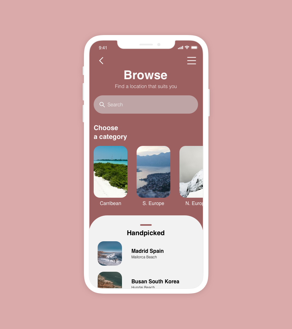
I was thinking about browsing travel locations easily and quickly, this started with a horizontal scroll of categories as well as a card for a curated list.
Promotion
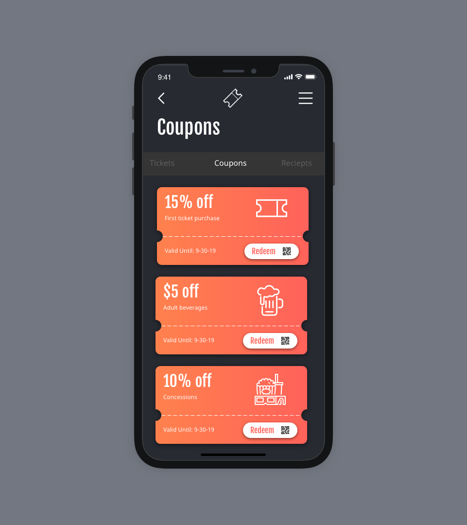
This design for promotions within a cinema app focused on the contrast of a dark scene with vibrant colors to call attention to the coupon cards in a way that was similar to theatre lighting.
Recipe
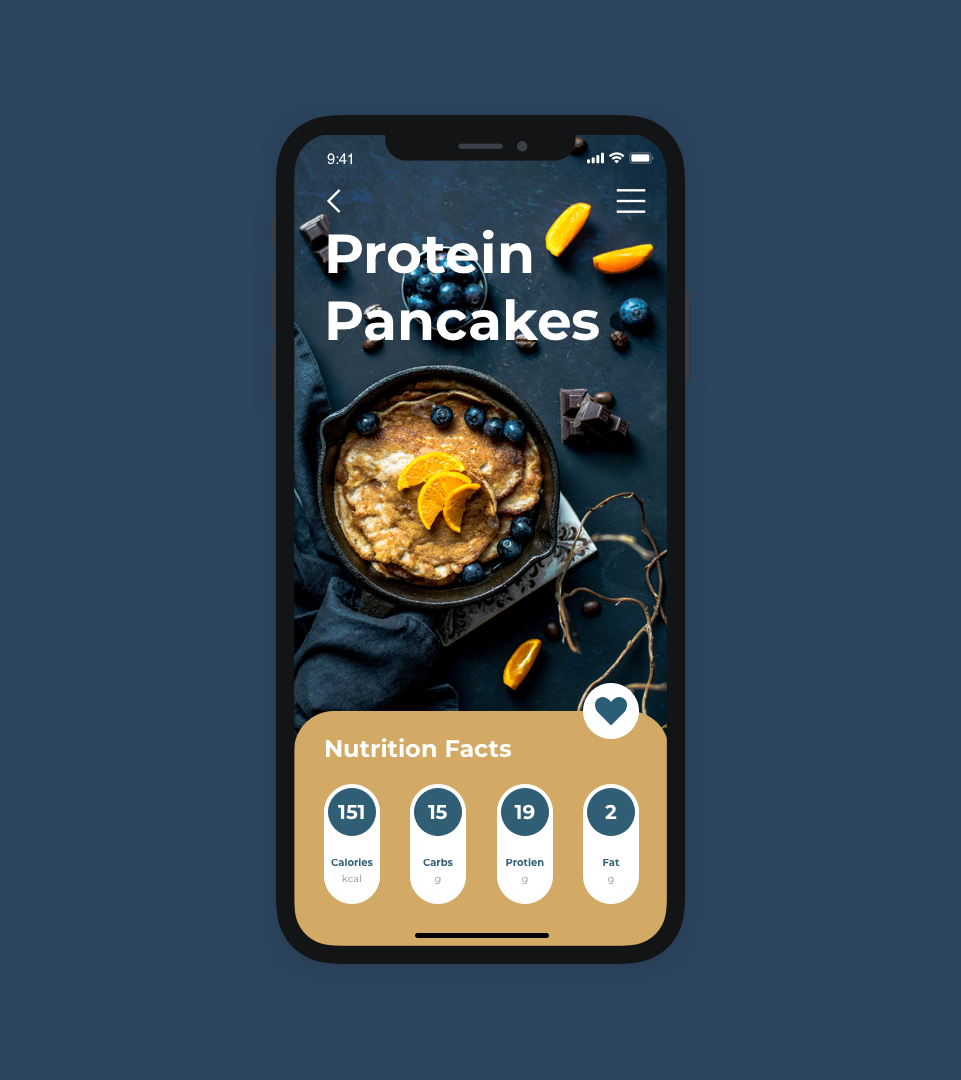
This was an idea for a recipe searching app, you could swipe through potential recipes based on category and quickly see their nutritional facts.
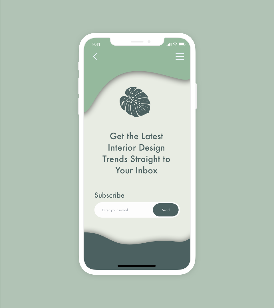
Subscribe
This on-boarding screen was meant to be aesthetic and inviting in order to implore the user to subscribe based on brand and message.
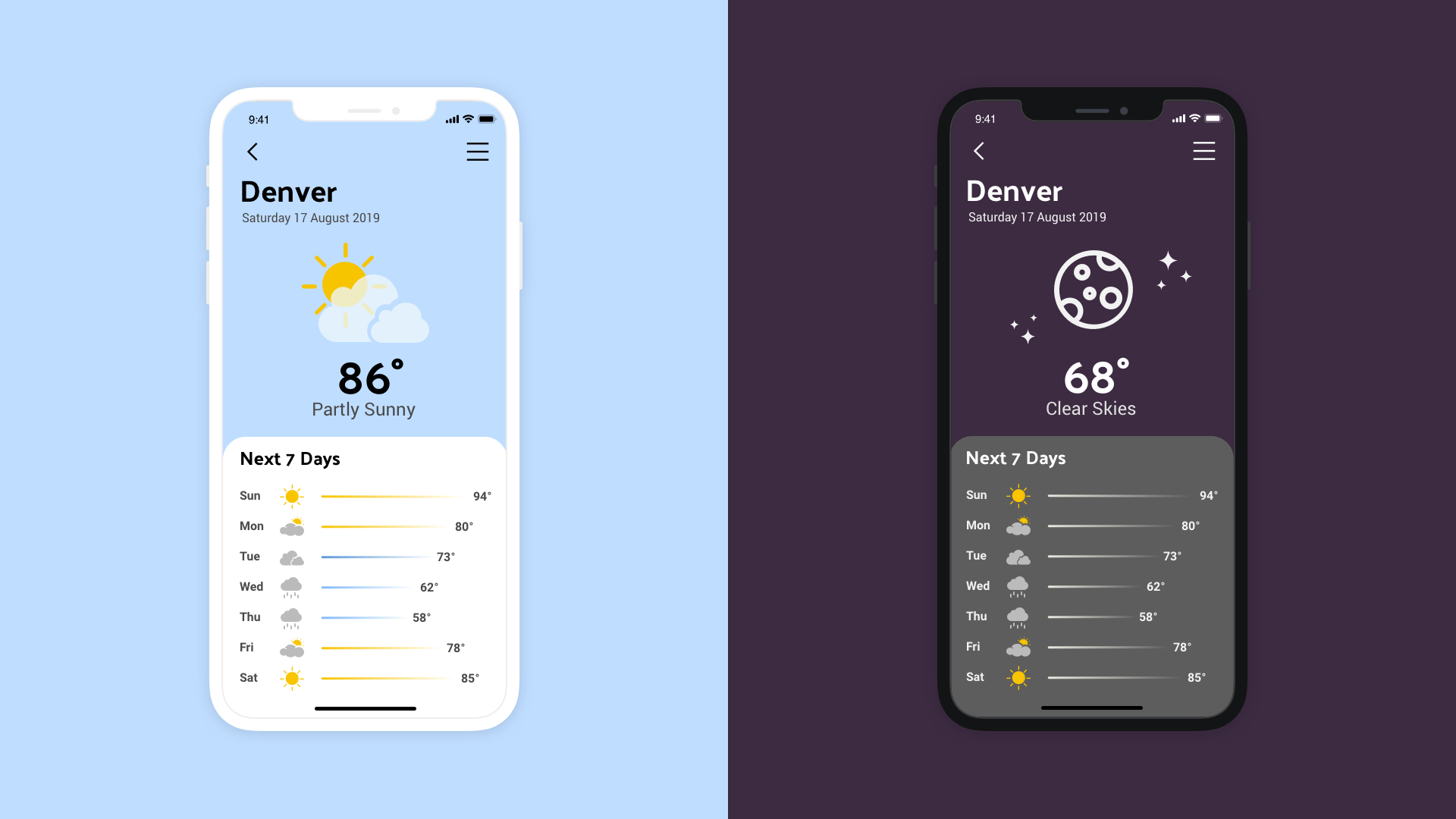
Weather
My approach was to try and keep everything simple and easy to understand at a glance, with a large header icon with and the most important information front and center. I then used icons and gradient bars to show the change of weather over the week by comparing lengths.
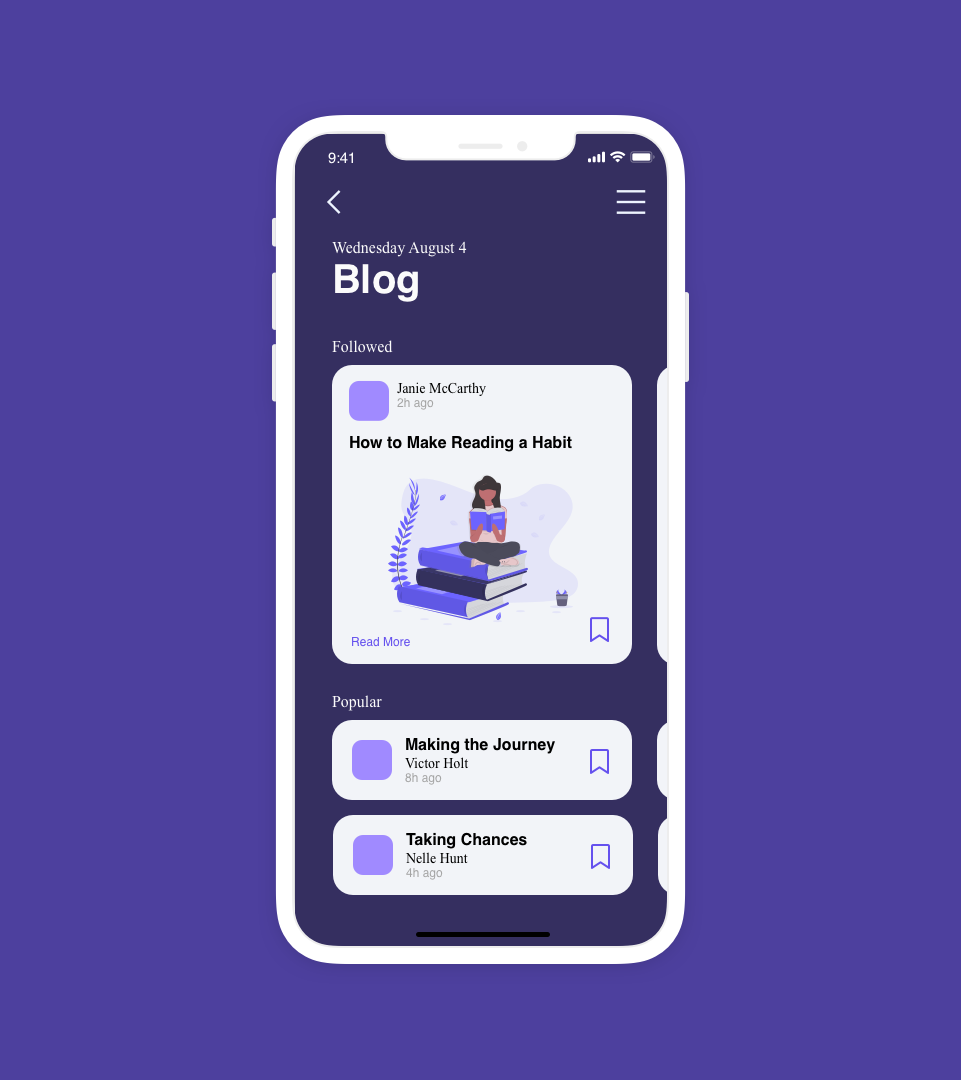
Blog
My approach to a blog page home-screen was to create easy to digest cards specific to those who you follow as well as popular recommendations. These all could be browsed with a horizontal scroll, the hierarchy of each card has a focus of the author and the icon to bookmark the content.
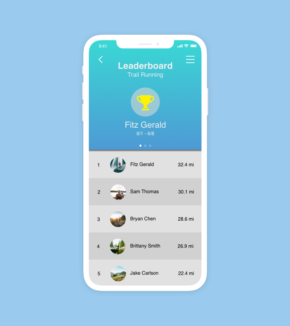
Leaderboard
This was a design meant to show the rankings of different runners at a glance, with emphasis on whomever held first place. Using pagination you could quickly swipe through to the second and third place winners as well.